pixpeep
Peep these pictures.
Continue
Home
About
RSS
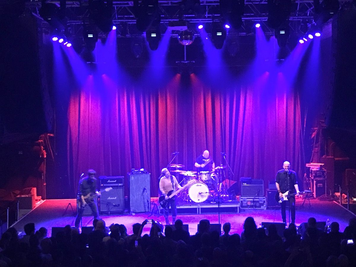
Jawbox
View Photo
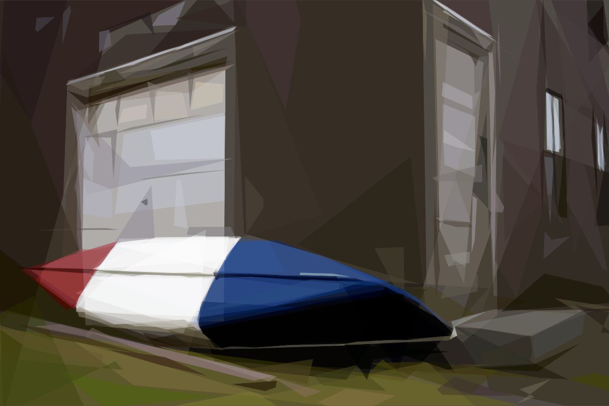
Bash Bish
View Photo
Americana Redux
View Photo
Slow Motion Waves
View Photo
Laundromat No. 2
View Photo
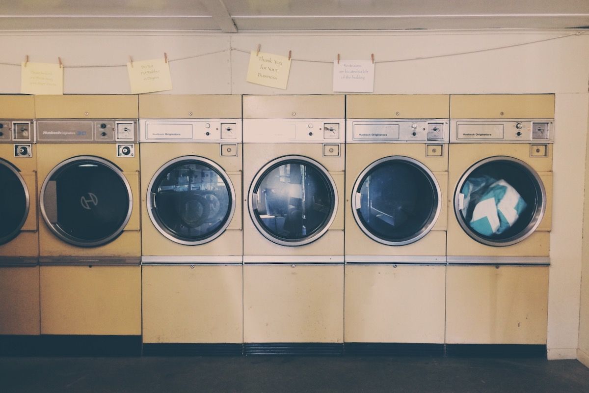
Laundromat No. 1
View Photo
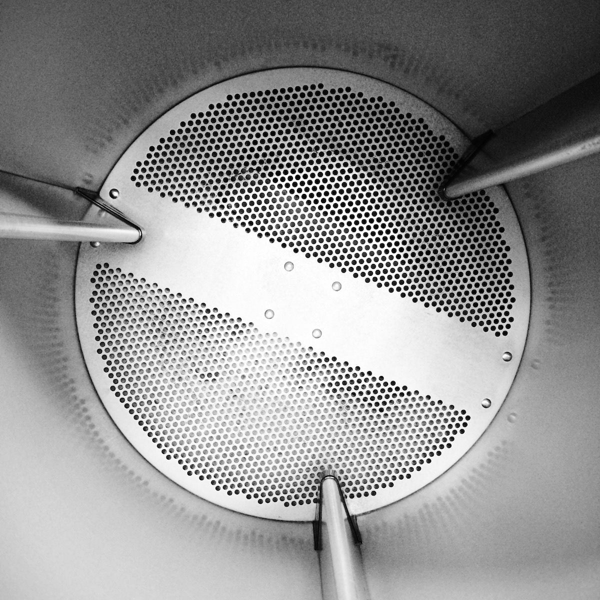
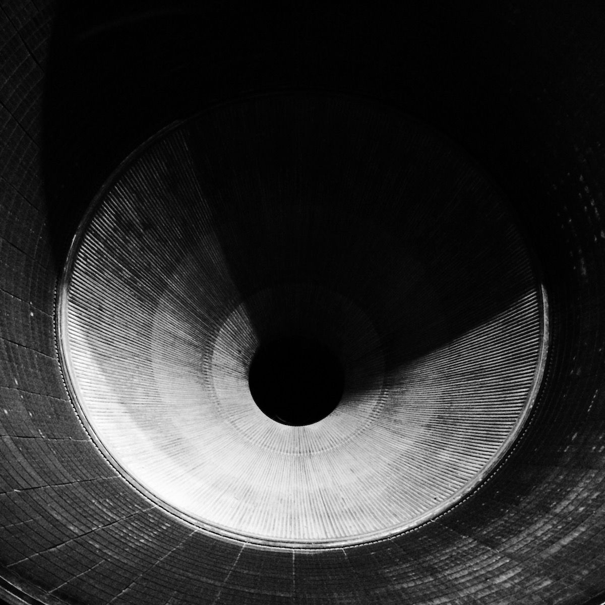
Saturn V
View Photo
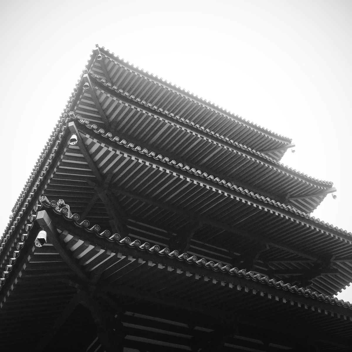
Pagoda
View Photo
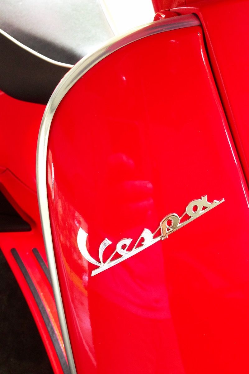
Vespa
View Photo
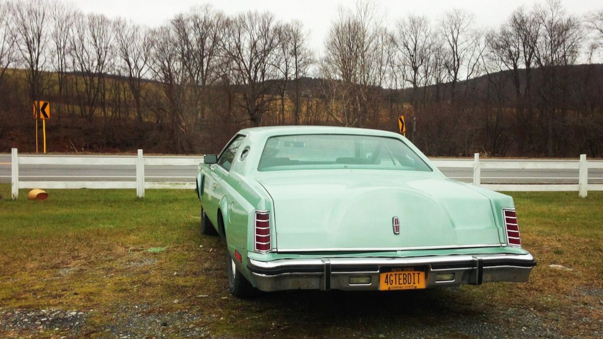
4GTEBDIT
View Photo
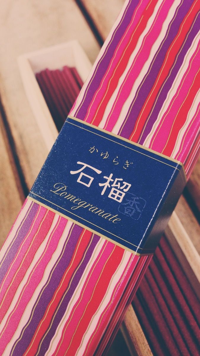
Pomegranate
View Photo
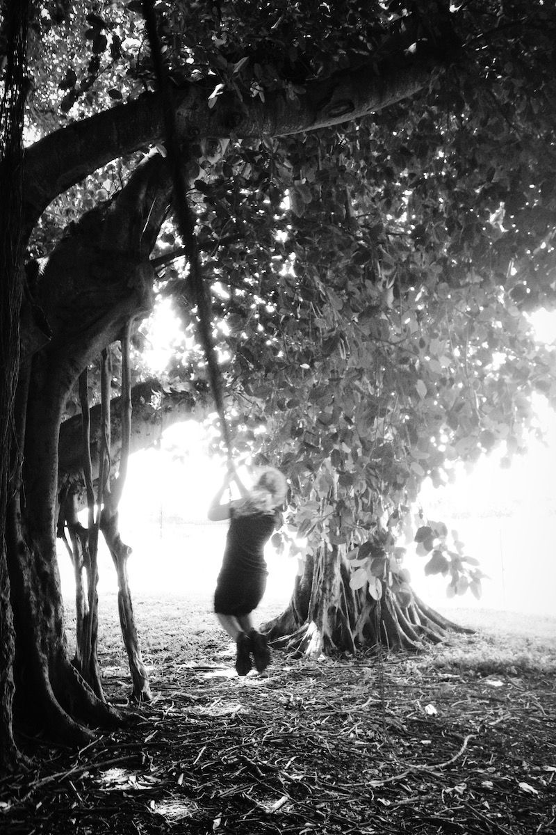
Swinging on Vines
View Photo
© pixpeep